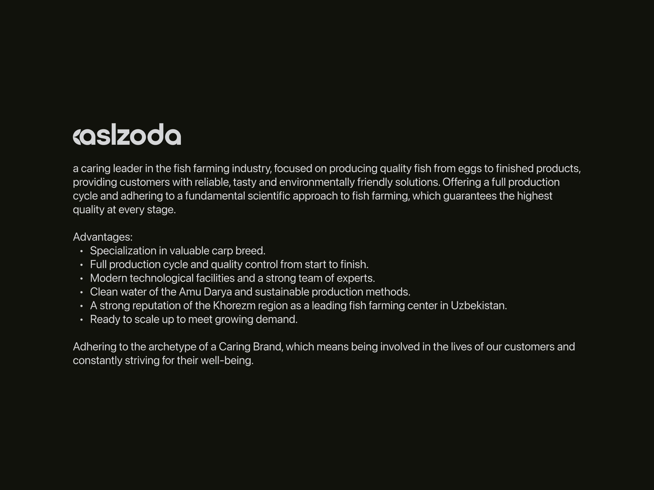
Aslzoda
Logo Design & Branding
2024
Lead Designer
Project info
Scope
Objective: Develop a logo and branding for a fish farming company embodying the archetype of "The Caregiver." The brand aims to convey reliability, dedication to quality, and an eco-friendly approach to fish farming, focusing on a comprehensive production cycle and scientific rigor at each stage.
Target Audience: Consumers seeking high-quality, sustainable seafood; environmentally conscious buyers; and stakeholders in the food and fish farming industries.
Goals:
1. Create a logo that symbolizes care, precision, and eco-consciousness.
2. Develop a brand identity that communicates the brand's scientific approach and dedication to producing safe, tasty, and sustainable products.
3. Ensure that the branding appeals to a wide audience, including retail customers and industry professionals, emphasizing trustworthiness and product quality.
Process
Research and Discovery
Analyzed competitors in the fish farming and aquaculture sectors to identify unique branding opportunities.
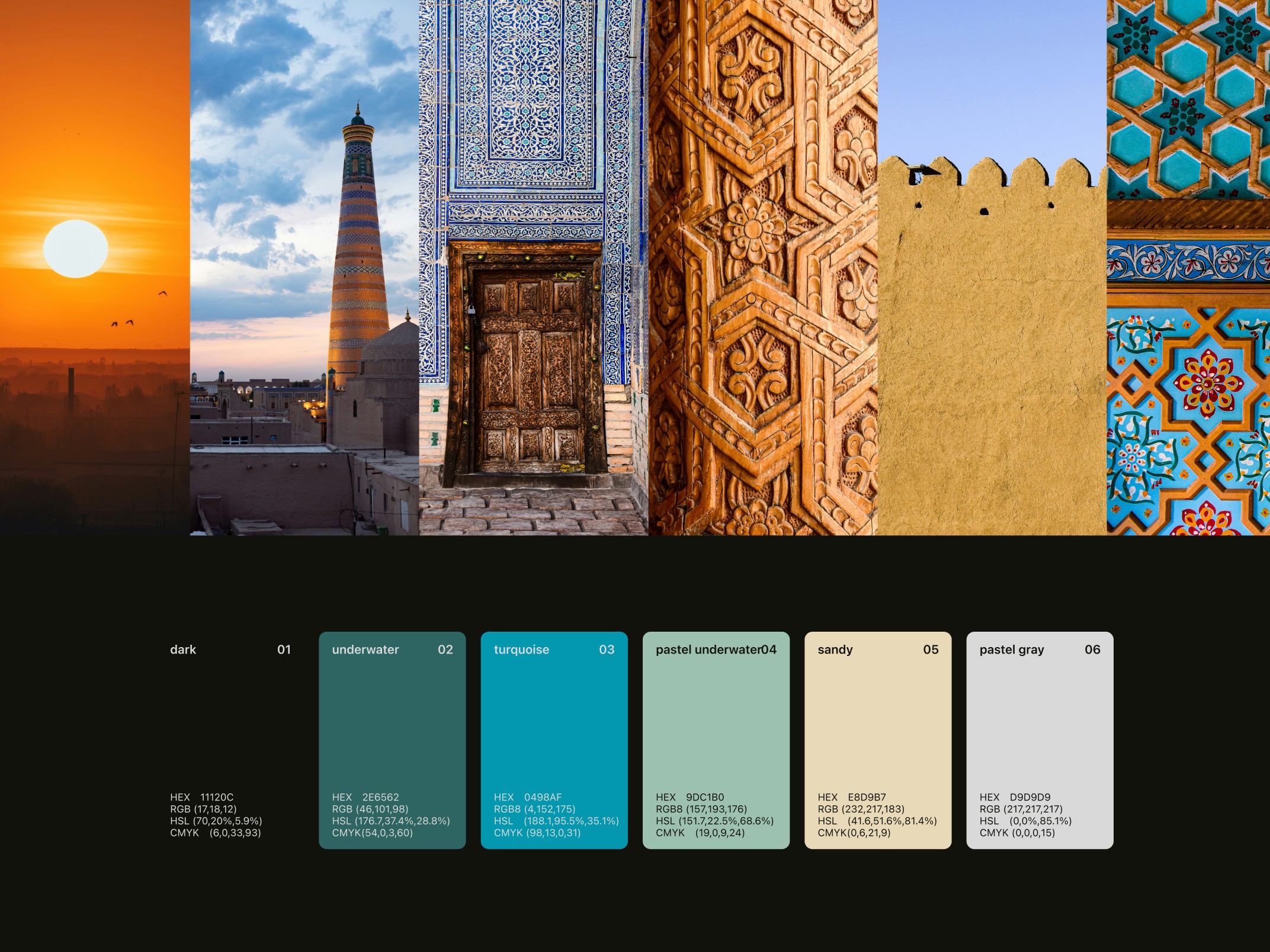
Explored symbolism in oceanic and freshwater motifs to find elements that resonate with the idea of care, purity, and quality.
Studied scientific and environmental themes to integrate a sense of trustworthiness and the brand's commitment to responsible fish farming.
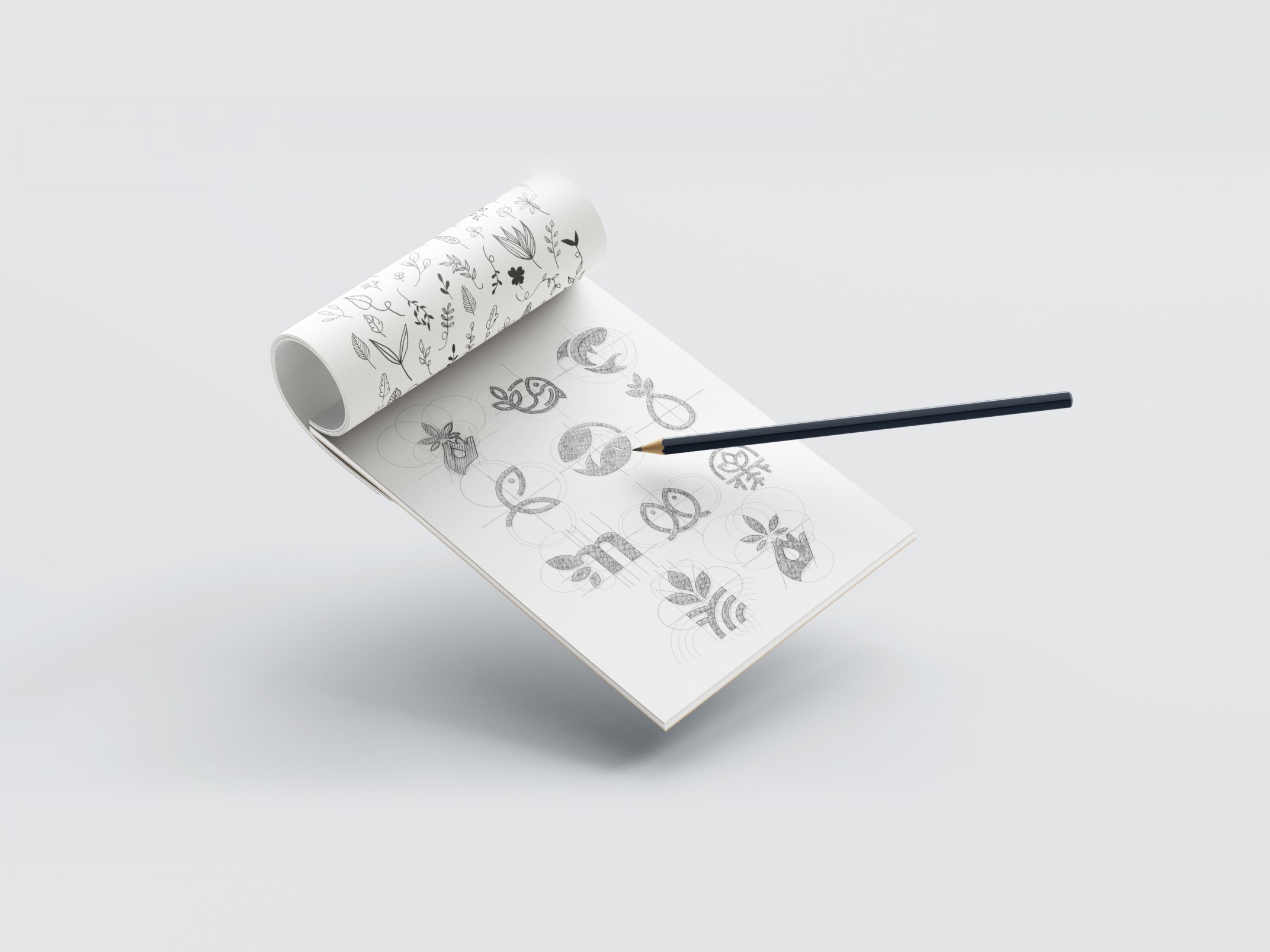
Concept Development
Brainstormed logo concepts that combine aquatic symbols (such as waves, fish, water droplets, or a nurturing hand) to represent the "Caregiver" archetype.
Developed a color palette with soothing and earthy tones, such as deep blues, greens, and natural shades, to convey sustainability, cleanliness, and professionalism.
Chose fonts with a modern yet approachable feel to highlight scientific credibility without sacrificing warmth.
Design and Refinement
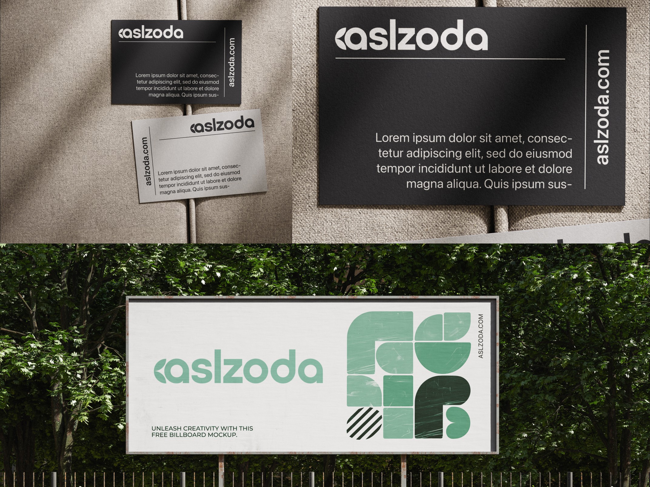
Created initial logo drafts with various symbol and typography combinations, emphasizing simplicity and scalability for easy use across packaging, digital media, and print.
Presented several logo concepts to stakeholders, gathering feedback on emotional impact, clarity, and brand alignment.
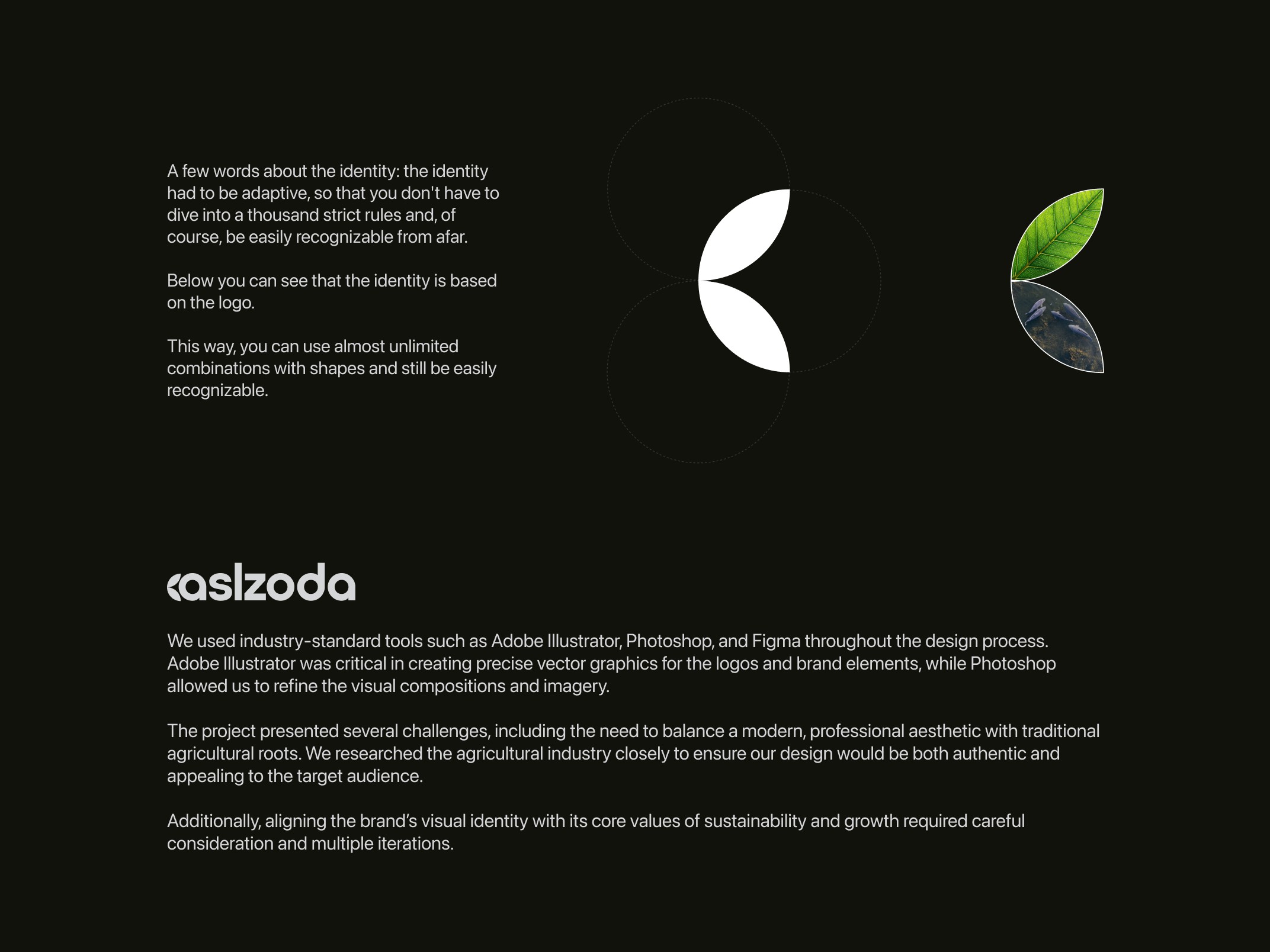
Refined the chosen logo based on feedback, adding subtle details that reflect the fish farming cycle and scientific approach, such as streamlined lines and circular forms to represent continuity and growth.
Brand Identity Development
Designed a set of brand assets, including color guidelines, iconography, and imagery that reflect the company’s commitment to quality and ecological responsibility.
Created mockups of potential applications (e.g., product packaging, website, promotional materials) to illustrate cohesive branding.
Solution
The final branding for the fish farming company:
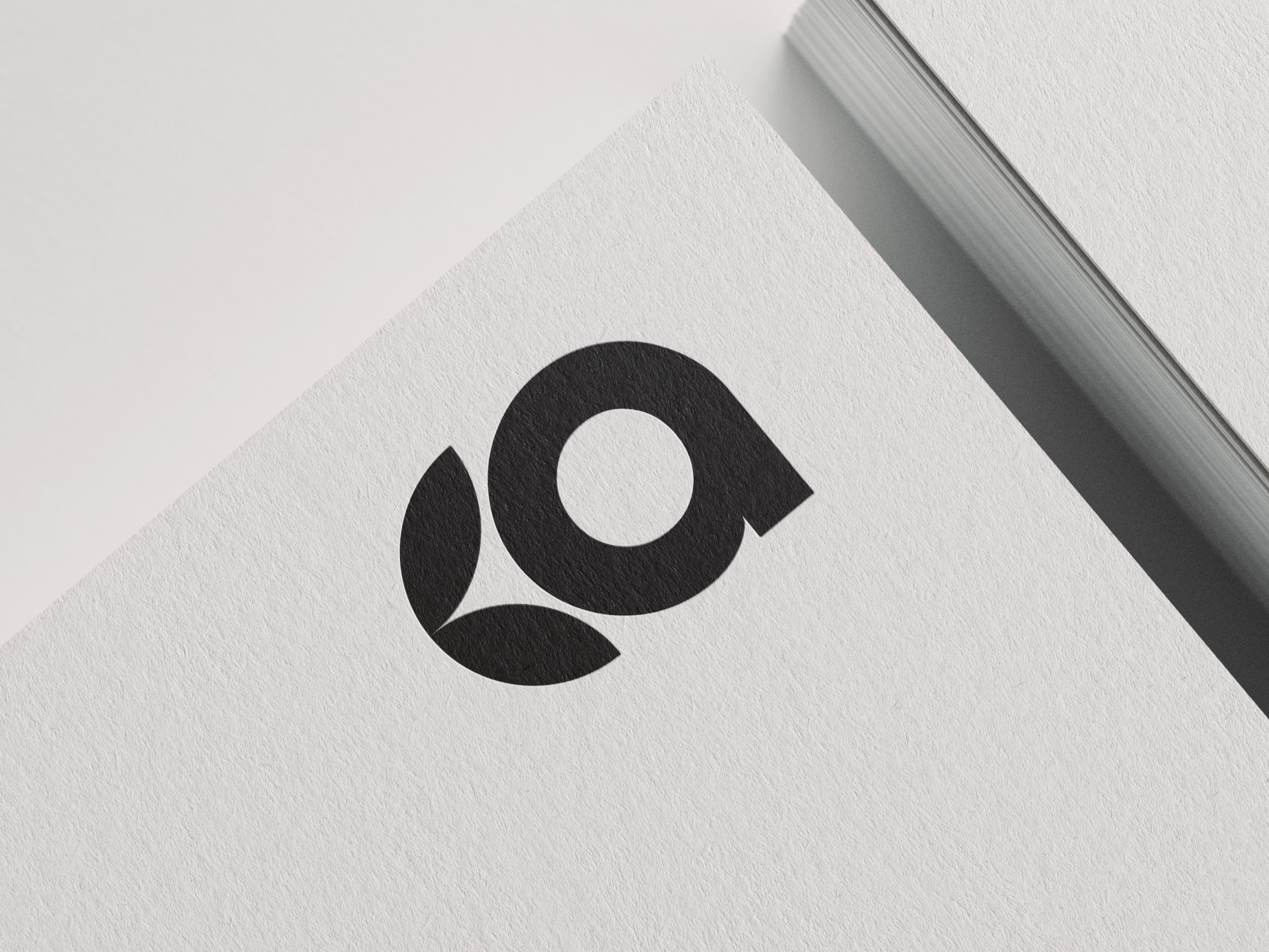
Features a logo with soft, flowing lines that symbolize both water and a nurturing hand, evoking trust and care.
Utilizes a calming, natural color palette that reinforces the eco-friendly and scientific approach of the company.
Integrates brand elements that balance professionalism with warmth, appealing to customers looking for quality, eco-conscious seafood solutions.
Presents a cohesive and recognizable brand identity that clearly communicates the company’s mission and dedication to quality from egg to plate.